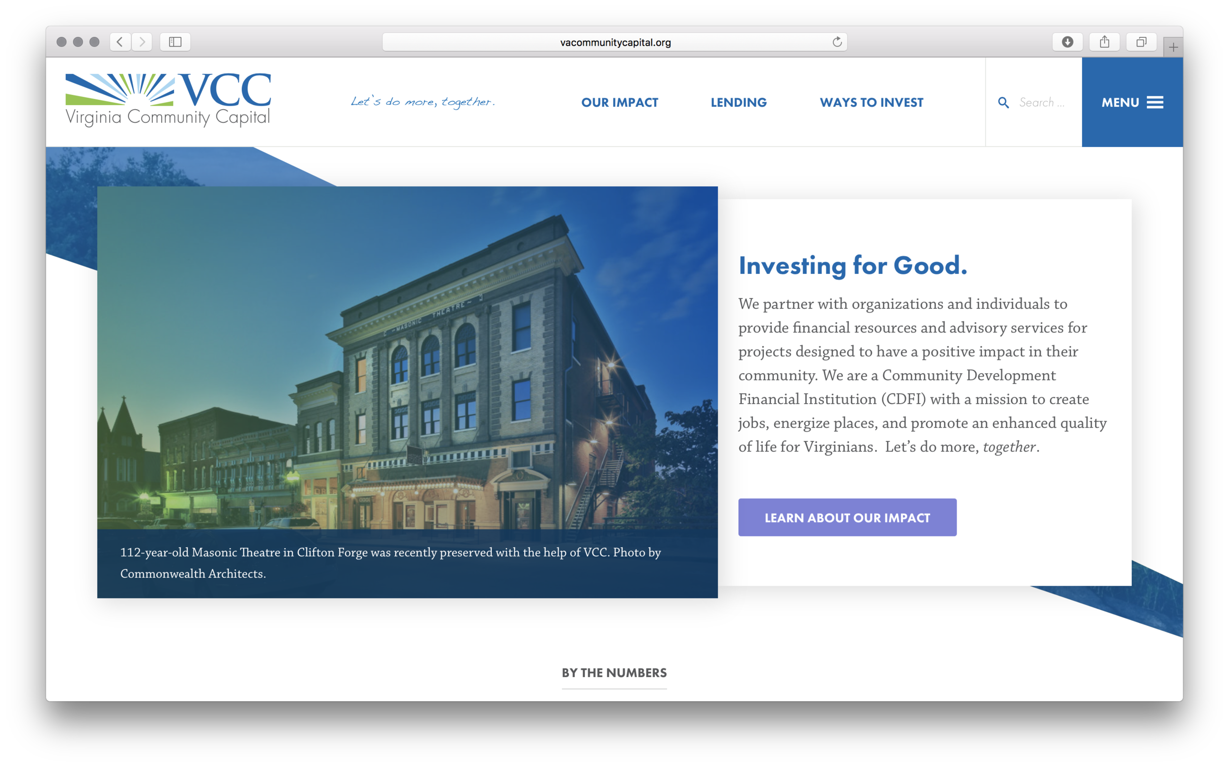
Creating a story — not a digital brochure
Too many companies make the mistake of using their website as a basic digital brochure. Or they load them up with keywords, in hopes of being found by Google, and wind up getting nowhere. Great websites should tell a story, and those who write them should never purposefully stuff them with fluff.
Our longtime partners at Virginia Community Capital were in dire need of a new website, which, among other issues, was built on outdated technology, had few if any calls to action, and lacked mobile-responsiveness (Or is it "responsivity?" Whatever). We worked alongside our insanely talented friends at Co+Lab, the Richmond based web and digital development group, to create a website for the client that truly shines.
Kelley handled all the copy - built to financial regulations and compliance - and worked closely with both sides to keep the project on time and budget. To get the content to its fresh new state - including its double-meaning headline, "Investing for Good." - we worked closely with numerous stakeholders both inside and out of VCC to craft and execute a well-rounded, deep story for the financial institution.

